Code
root <- "C://Users//s1769862//OneDrive - University of Edinburgh//SLTF-workshop-August2024//" # change with where the folder lies in your filepath
cws <- readRDS(file= file.path(root, "Data", "cws.RData"))This section covers data visualisations using survey design-adjusted plots.
Remember that we “saved” our wrangled dataset to the working directory in the previous section as an RData file in our workshop folder.
root <- "C://Users//s1769862//OneDrive - University of Edinburgh//SLTF-workshop-August2024//" # change with where the folder lies in your filepath
cws <- readRDS(file= file.path(root, "Data", "cws.RData"))design1 <- survey::svydesign(ids = ~SchoolRef, strata =~Strata, weights = ~Weight, data =cws, check.strata=T)We want to take advantage of R’s good graphics but the typical plotting options, e.g. base R plot or ggplot2, are not coded to intake a survey design object to make their calculations. This means that weighted estimates and standard error visualisations will be incorrect.
Therefore, we need to specify the sampling design in the plotting arguments.
The survey package has inbuilt plotting functions that work out-the-box.
Include ~1 to specify the lack of a second variable in univariate plots.
survey::svyhist(FeelPositiveFuture~1,design1)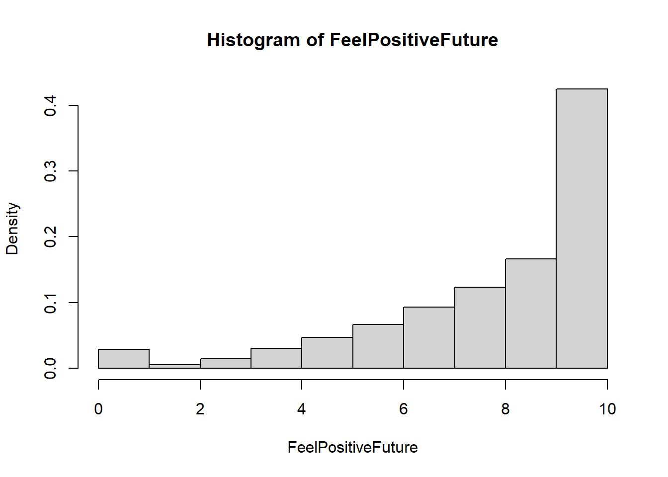
Looking at the range, the distribution of positive feeling is right-skewed.
The syntax is very similar for a boxplot.
We can also perform some basic modification, including adding a main title with main = "title" .
survey::svyboxplot(FeelPositiveFuture~1,design1,
                   main = "Feelings of positivity for the future, 12 year olds in England")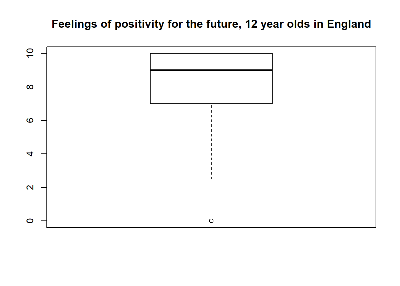
To investigate bivariate relationships with a boxplot we can replace the ~1 with a categorical variable.
survey::svyboxplot(FeelPositiveFuture~HomeType,design1,
                   main = "Feelings of positivity by living situation, 12 year olds in England")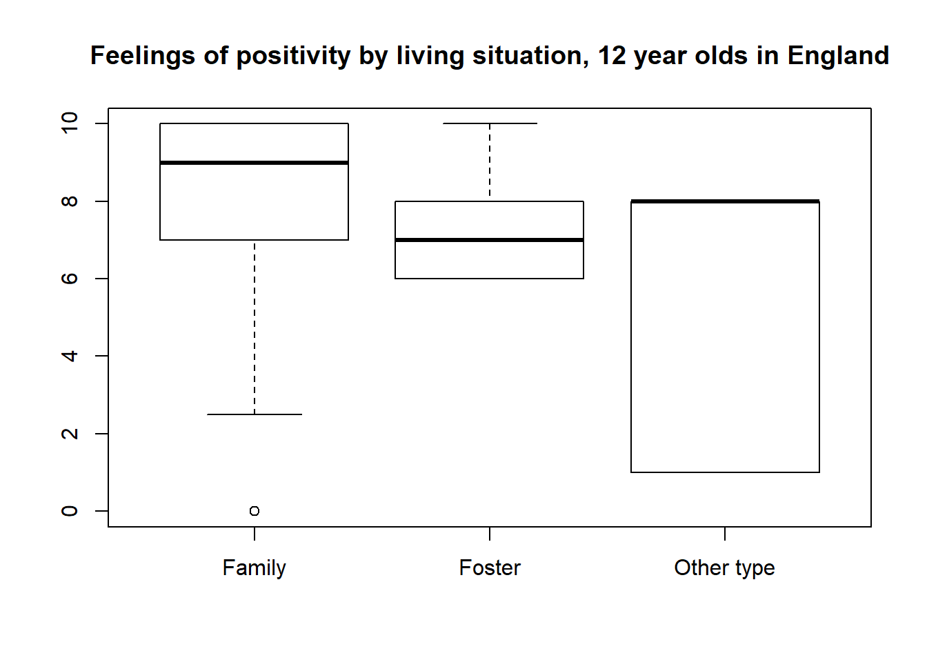
It appears that there is greater variance in feelings of optimism for those in a type of home other than a family or fostering situation.
survey::svyplot(FeelPositiveFuture~SatisfiedHealth,
                design1,
                xlab = "Satisfaction with health",
                ylab = "Feelings of positivity",
                main = "Relationship between health satisfaction and positivity",
                style="grayhex")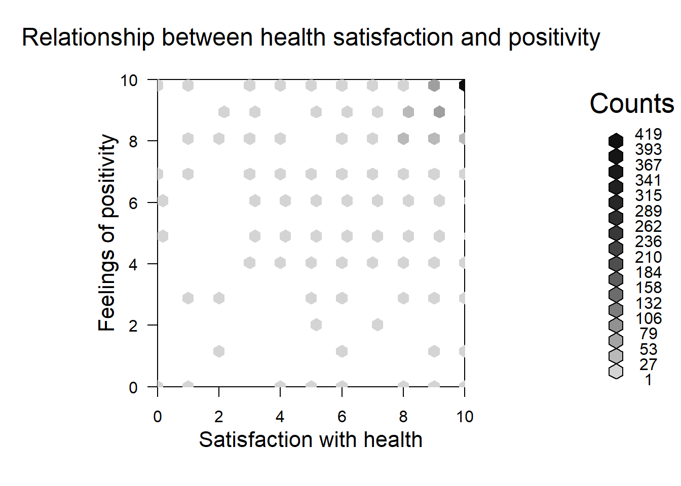
Now, try out your own svy plotting options!
Key functions for main plot types include:
svyhistsvyboxsvyplotAdvanced: try to create both univariate and multivariate plots!
## write your own code!

## tip: copy and past from previous code chunks!The survey plots are great, but they are pretty basic. I also find the syntax non-intuitive.
The ggsurvey function offers an excellent range of options for plotting with complex survey design. It is part of the larger questionr package, which packages several survey functions.
ggsurvey is (to my understanding!) akin to wrapper for ggplot2 that incorporates the estimate corrections provided by survey package calculations. Therefore, if you already know ggplot grammar, you know how to make survey design corrected plot 1.
The hegemony of ggplot grammar also makes it much easier to get help debugging your plots on forums like Stack Overflow.
ggsurvey(design1) +
    aes(x = FrequencyHelpHousework, fill = Gender) +
    geom_bar(position = "fill") +
  labs(title = "Frequency of housework by gender",
       subtitle = "Children in England, aged 12",
       caption = "Data drawn from age 12 of the Children's Worlds Survey")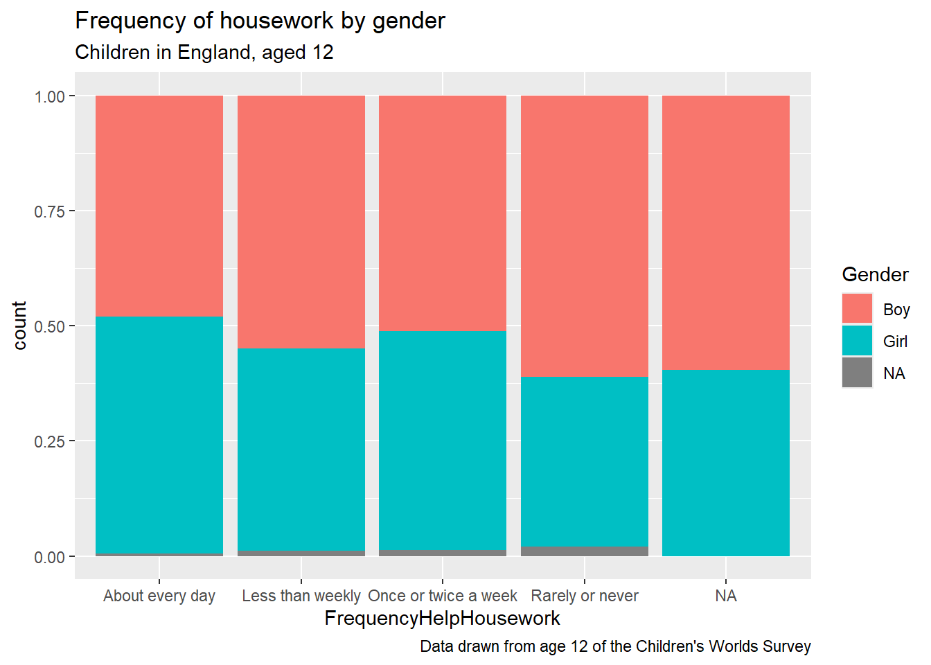
As with other ggplot2 objects, we can make this a lot prettier by customising the colour schemes and themes.
We can see what colour schemes are available from RColorBrewer using
RColorBrewer::display.brewer.all()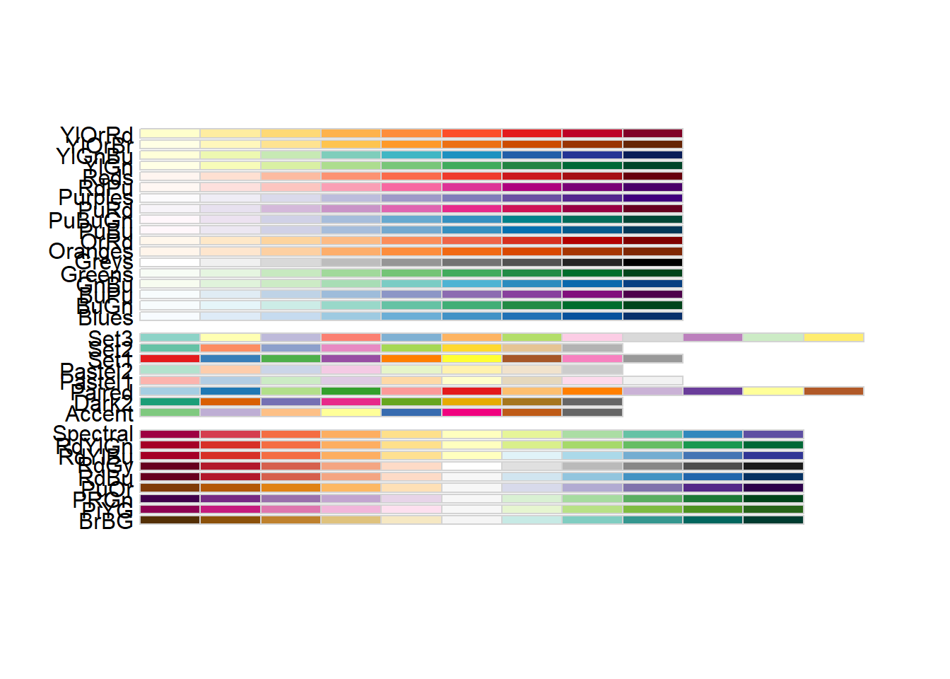
ggsurvey(design1) +
    aes(x = FrequencyHelpHousework, fill = Gender) +
    geom_bar(position = "fill") + scale_fill_brewer(palette = "Blues") +
  labs(title = "Frequency of housework by gender",
       subtitle = "Children in England, aged 12",
       caption = "Data drawn from age 12 of the Children's Worlds Survey")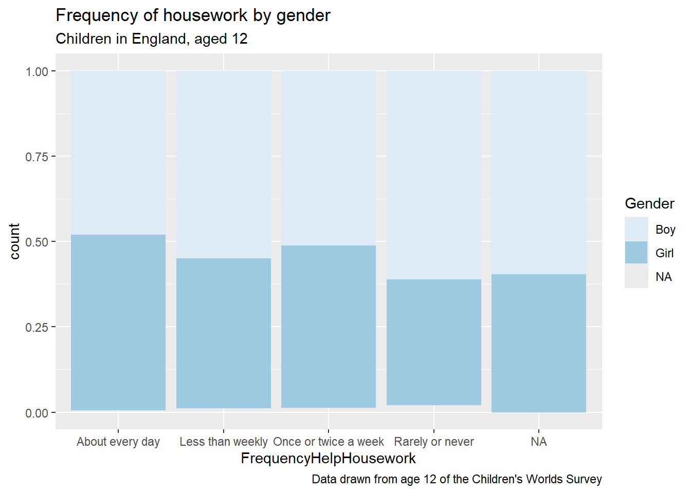
We can also utilise the ggthemes package for pre-set colour schemes and other plotting options.
ggsurvey(design1) +
    aes(x = FrequencyHelpHousework, fill = Gender) +
    geom_bar(position = "fill") + scale_fill_brewer(palette = "Blues") +
  labs(title = "Frequency of housework by gender",
       subtitle = "Children in England, aged 12",
       caption = "Data drawn from age 12 of the Children's Worlds Survey") +
  ggthemes::theme_economist_white()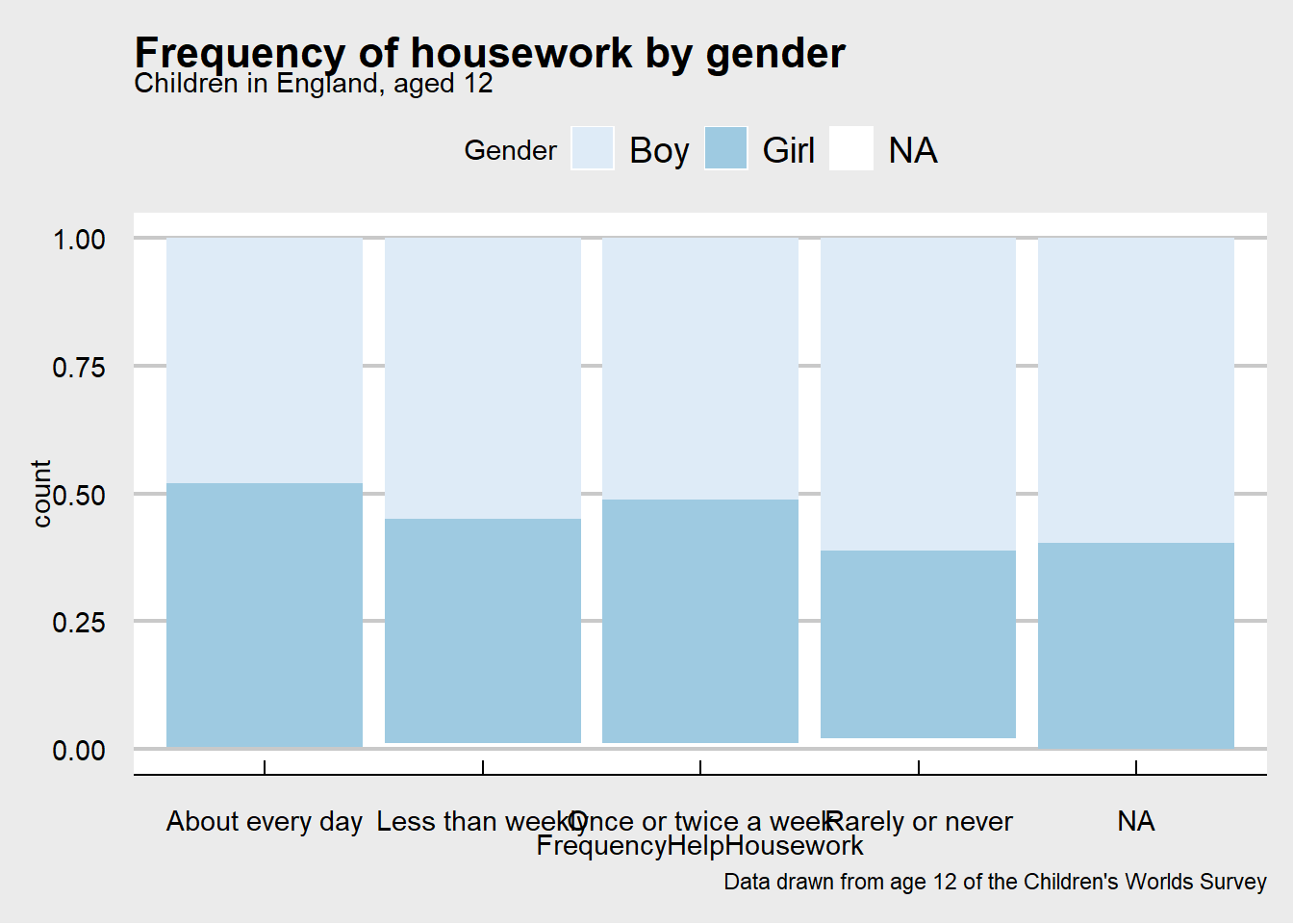
There are many geometries available, including boxplots.
The boxplot geometry requires an underlying package quantreg which is not currently included in the original install. If your are getting an error check to ensure that this package is installed and loaded in your R session.
ggsurvey(design1) +
    aes(y=FeelPositiveFuture,
        x=HomeType,
        fill=HomeType) + geom_boxplot() +
  scale_fill_brewer(palette = "Paired") + theme_classic() +
  labs(title = "Feelings of positivity by living situation",
       subtitle = "Children in England, aged 12",
caption = "Data drawn from age 12 of the Children's Worlds Survey") 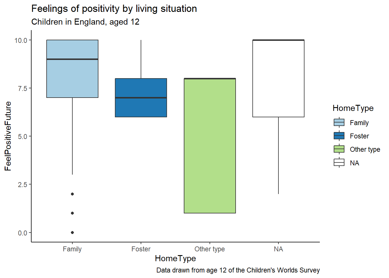
Make your own plot!
Look at the data documentation for questionr (the ggsurvey function is located on page 18) and ggplot2 and more ggplot2, including cheat sheets
## write your own code! Look at the previous chunks for help.Double-check the data documentation for plots with more complicated statistics, e.g. geom smooth functions.↩︎